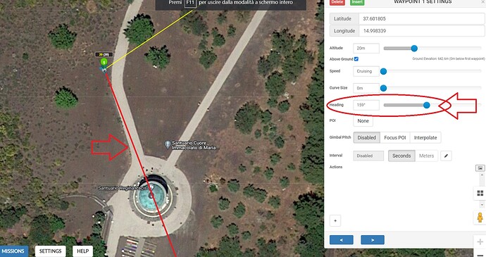
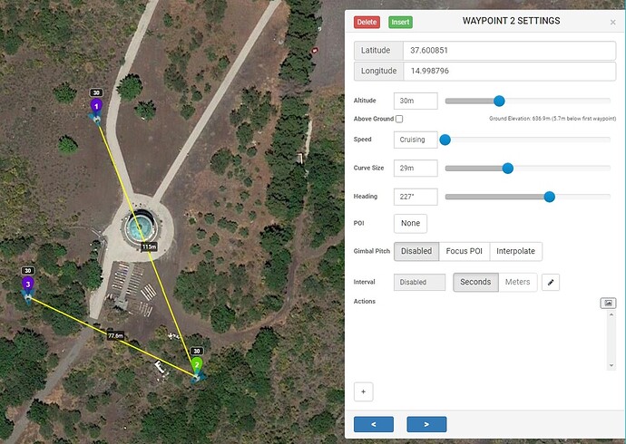
I would find it very useful if a line (for example red) would indicate the Heading Trajectory.
what do you think?
Thanks Marco
The blue arrows indicate the heading trajectory.
yes, but we could be more precise if there was an imaginary projection of the trajectory, right?
as drawn in the image, the projection of the trajectory would improve the accuracy of the heading.
thank you
So how would you indicate it when you have the drone flying facing say 90 degrees to the path and the drone is between waypoints.
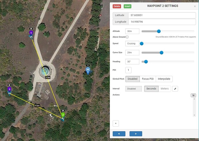
In the example3 you posted above if you wanted it to point at building, i’d shove a POI on it
How many metres long would you want this red line to be ?
I don’t see the point of this idea, I would never use it,
It will be just more clutter on the Litchi screen.
Thanks Archer, I don’t like to use POIs if I don’t have to …
In order not to confuse the small screen, it would be enough if the LINE was only available in the WEB version,
also the length of the LINE could be 100 meters and it could be activated, optionally, by checking a box next to the waypoint HEADING cursor.
Infinitely grateful for your attention, I send a cordial greeting.
Almost all DJI drone cameras have a horizontal Field of View between 82° and 88°, this makes a precise heading setting almost obsolete.
If on any waypoint you want the camera pointing presicely at a specific object, place a POI at that object:
- In Mission Settings ‘Heading Mode’ must be ‘Custom (WD)’.
- Place waypoints at desired locations (Plan your mission).
- Place a POI at desired object.
- Click on the desired waypoint to edit it and choose that POI. The Heading of the waypoint changes accordingly.
- Delete the POI.
or - Leave the POI and set ‘Gimbal Pitch’ to ‘Focus POI’ if you also want the camera to tilt.
Because ‘Focus POI’ is based on Interpolation, you need at least 1 extra waypoint in front of the desired waypoint with ‘Gimbal Pitch’ set to either "Focus POI’ or ‘Interpolate’.
I would show the line only, when the slider for “heading” is grabbed by the mouse or when a new value is entered by keyboard.
Otherwise I agree, there would be much confusion on the screen whit all “long arrows” visible.


