Let me please first describe the problem, and then the request or possible solution?
I’m basically cutting a large 400x300m survey into 12 100x100m surveys because of the battery. Then I can safely conduct 1 or even 2(depending how far away I am) flights per battery.
I tried to do this in a single flight plan - but this would result in many waypoints to properly follow the elevation profile on the Mavic 2 Pro.
Why? Because I would need to change the batteries several times. In Pix4d this is doable because it remembers where I was left and continues than at that point.
In Litchi I need to manually select that point, and this is almost not doable.
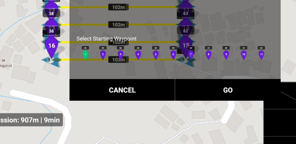
The colour for the way-points in sunlight during survey is very hard to see anything on the screen and then the numbers 1,2,3 etc.. of the way-points are so small - for me to view this and remember something I can barely read/see is too much room for error, so then I must split a large survey into 12 smaller ones (which takes a lot of flight planning)
So my suggestions:
- include a feature to abort, pause, call in drone, exchange battery - resume where left off
- change the colour to something more readable even in sunlight
- larger numbers